
New Map, True World! The UN Just Changed How We See Our Planet
Quick Summary
The United Nations voted this month to start using a new kind of world map. The old map made some countries look much bigger than they really are. The new map shows countries and continents in their true, correct sizes.
What Happened?
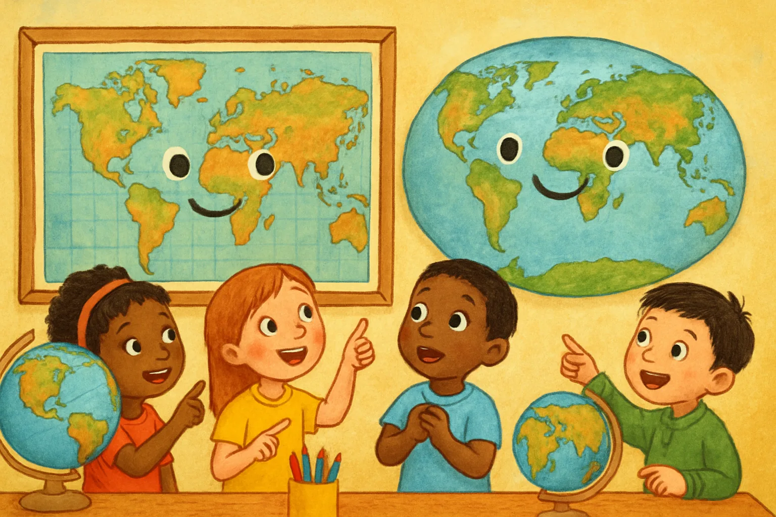
You have probably seen a world map on a classroom wall. That flat, rectangular map has been the most famous image of Earth for about 450 years. It is called the Mercator projection, and it was invented in 1569 to help sailors navigate the seas.
The Mercator map is great for sailors. But it has one big problem: the farther a place is from the equator — the imaginary line around Earth’s middle — the bigger it looks on the map. Countries near the poles get stretched out and look enormous. Countries near the equator look much smaller than they really are.
Here is a mind-blowing example. On the old map, Greenland looks almost as big as Africa. But in reality, Africa is about 14 times larger than Greenland. Africa is roughly the size of the United States, China, India, Europe, and Japan — all combined!
On September 4, 2026, the United Nations General Assembly voted 164 to 1 to encourage countries, schools, and media to switch to a new map called the Equal Earth projection. The resolution was introduced by African nations, who argued that the old map made their continent — and other places near the equator — look unfairly small.
The new Equal Earth map was created in 2018 by a team of cartographers (map scientists). It shows every continent and country at its true relative size. It still looks familiar and rounded, but the proportions are correct.
The vote does not ban the old Mercator map. Ships can still use it for navigation. But world leaders hope schools and news organizations will start using the fairer map instead.
Why Does It Matter?
The maps we grow up looking at shape how we understand the world. If a map makes Africa look small, people might unconsciously think it is less important. Fixing the map is about fairness and accuracy.
For students around the world, this could mean a new kind of world map hanging on your classroom wall — one that finally shows every country as it truly is.
Big Words
- Projection — a way of drawing the round surface of Earth on a flat piece of paper; because Earth is a sphere, every flat map distorts something
- Equator — the imaginary line running around the middle of Earth, dividing it into the Northern and Southern hemispheres
- Cartographer — a scientist or artist who makes maps
- Resolution — an official decision or statement voted on by a group like the United Nations
- Distortion — when something is stretched, squished, or changed from its true shape or size
Fun Fact
The continent of Africa is so large that you could fit the entire United States inside it about three and a half times!
Think About It
Do you think the maps in your school show the world correctly? What would you change about a map if you could design one from scratch?
Sources
- CNN — ‘UN votes to adopt new map that makes our world look very different’ (Sep 4, 2026)
- ABC Australia — ‘New world map adopted by UN could reshape global perceptions of power’ (Sep 9, 2026)
- Visual Capitalist — ‘The New World Map the UN Wants You to Use’
- newworldmap.org — ‘New World Map 2026: What the UN Vote Actually Changed’